Our Reno Before + Afters
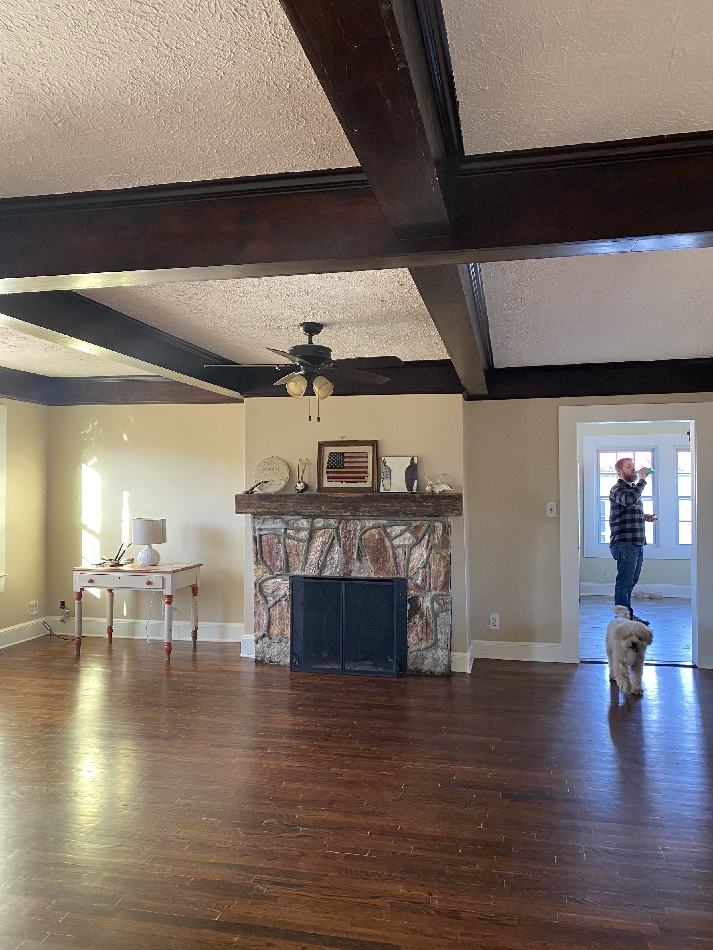
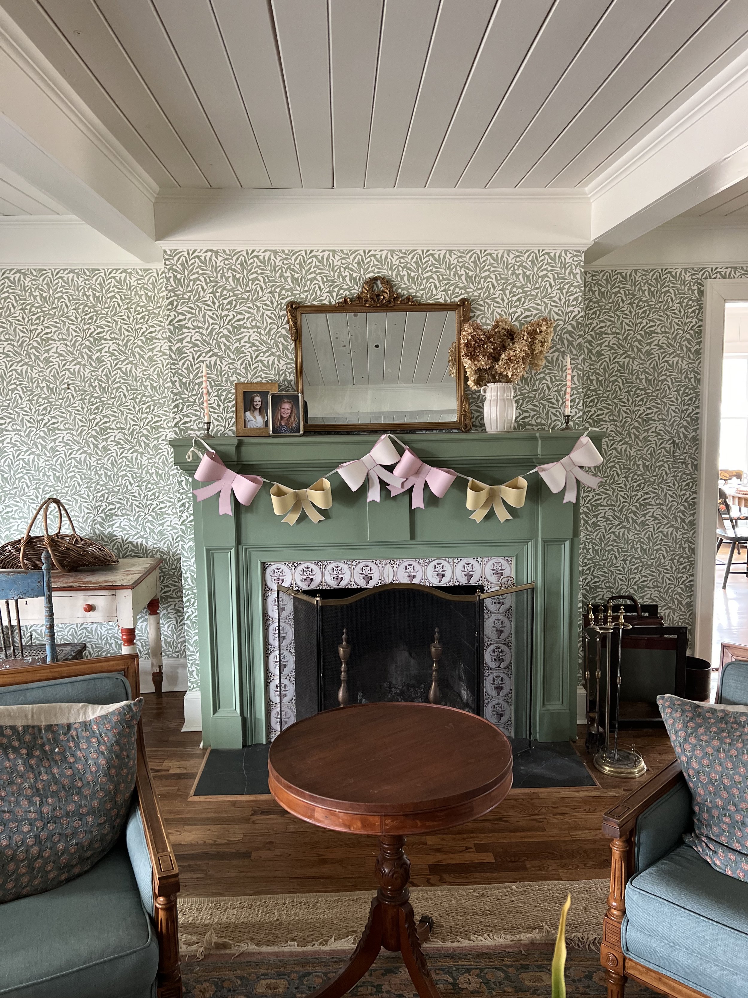
This week someone asked if we had ever shared the before and afters of our home and believe it or not we hadn’t. So grateful to be able to share these and also know how much work, sweat, and tears went into these two side by side photos. Our reno took about 18 months but almost two full years from when we first saw it.
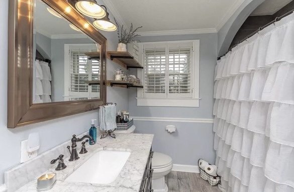
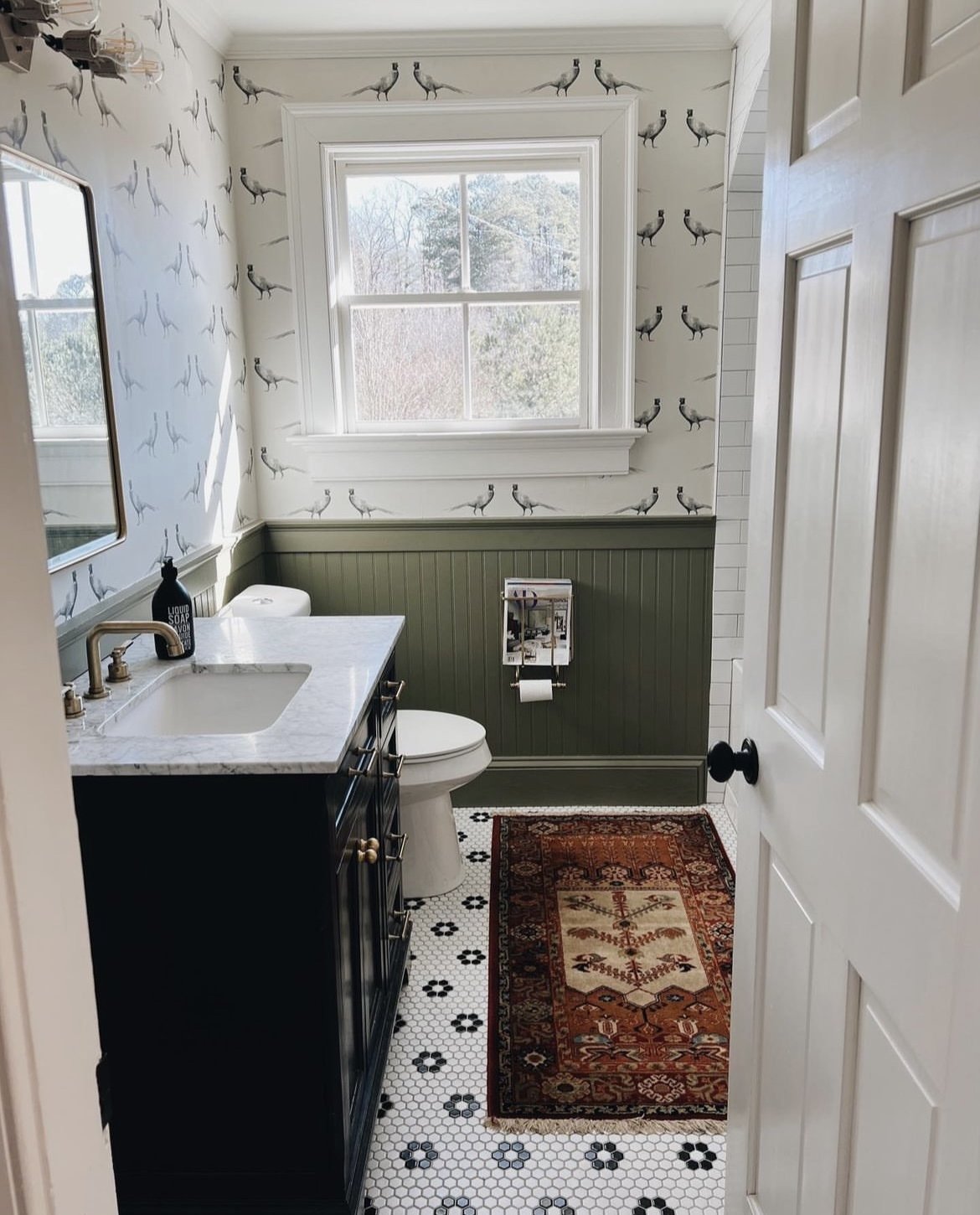
This bathroom above serves as the girl’s bathroom as well as our guest bathroom. We kept the vanity but updated hardware and removed the backsplash. We added beadboard below the existing chair rail and gave it a fresh coat of green. We added a vintage looking penny tile to the floor and subway tile to the shower (removing the existing prefab shower) and also added a soaking tub to the alcove that is deep enough for any adult to enjoy as well. Wallpaper details here and paint details here! Bathroom sources here.
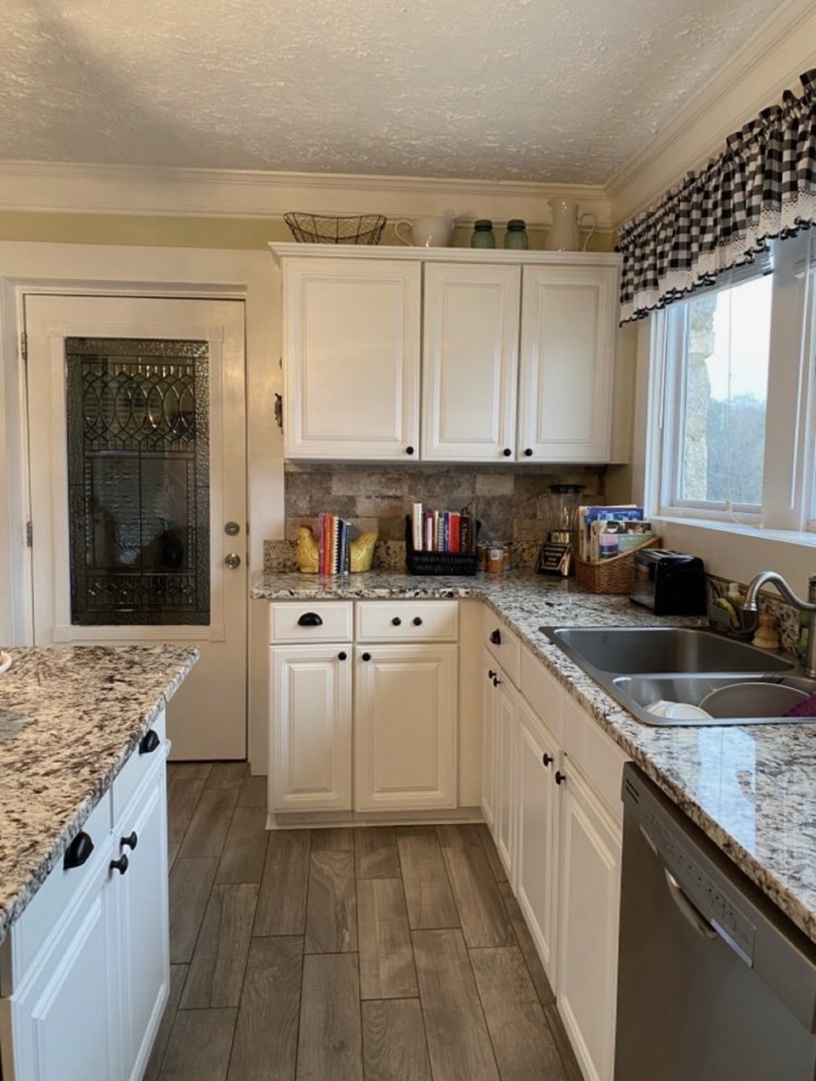
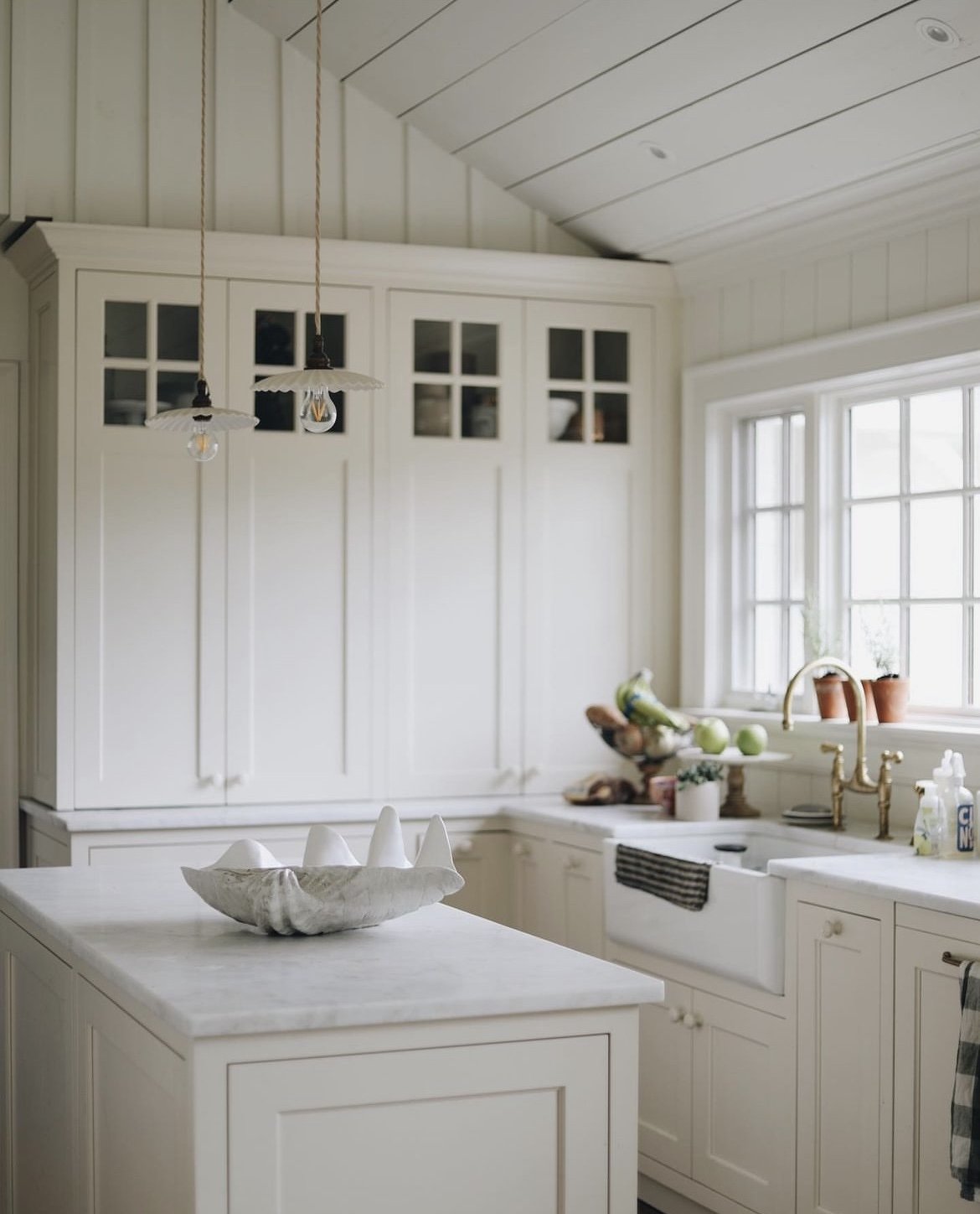
We gutted the original kitchen down to the studs, moved the door over to make room for the cabinets and created a cased opening that leads to the addition. After a major storm caused the exposed roof to collapse, it gave us the opportunity to vault the ceiling and add more character with some trim. It ended up being a happy disaster! We also added a new custom window and all new cabinetry, counter tops, and lighting. You can see all of the kitchen details here.
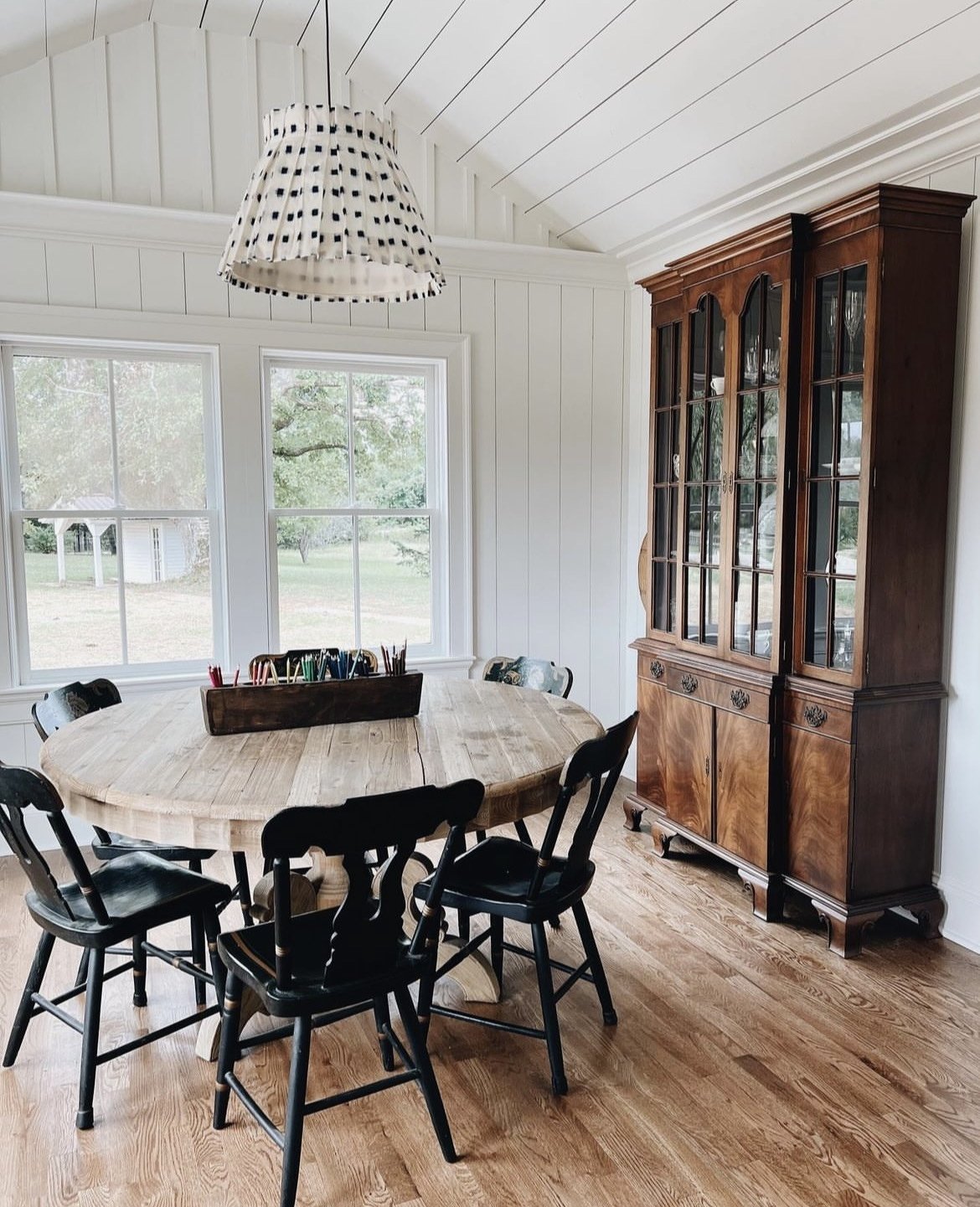
We eat almost every meal in the breakfast nook aside the kitchen, so it receives a lot of love. We added a window on the opposite side of the above image and can watch the sunset if dinner coordinates. I’m obsessed with the Alice Palmer lampshade and love its compliment to my great-grandfather’s china cabinet. Some of our favorite linens and dishes are listed here!
The fireplace is one of my favorite spots in the house, we use it regularly during cold seasons and it brings so much warmth. A lot of love went into its evolution and the last touch was adding Delft tiles. Our current Valentine mantle details.
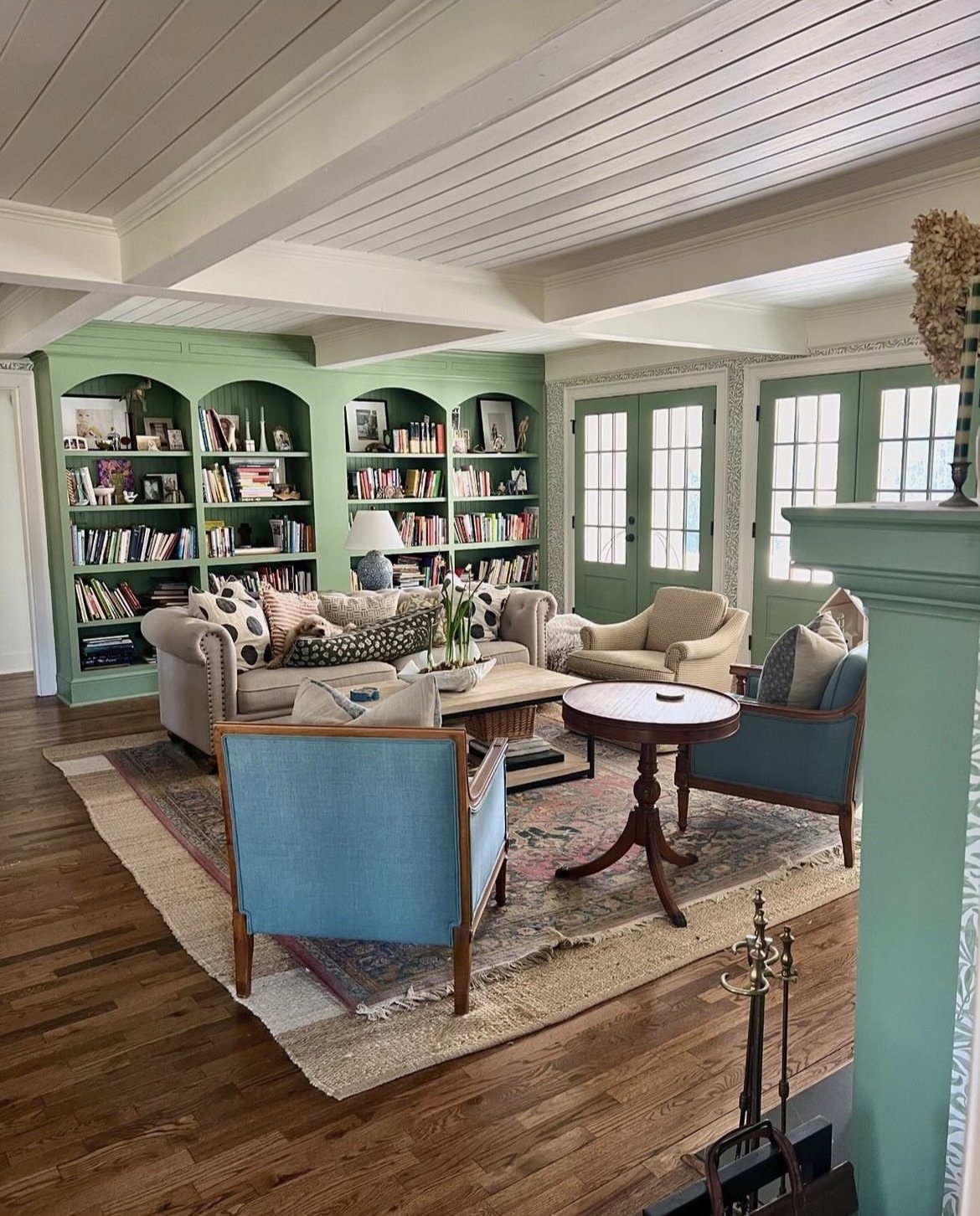
My dad assisted in the entire renovation and one of his long-time friends built the bookshelves. We added the French doors that open to a wide porch so that we could have more light in this room and view the lake. You can see another angle of the room and sources here!
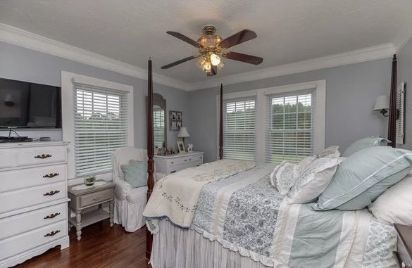
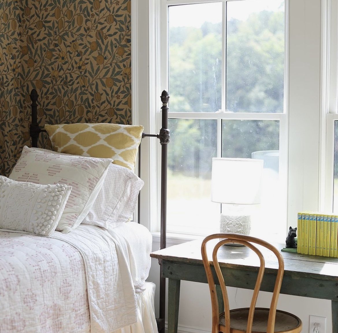
Phoebe’s room gets amazing light all day (she arguably also has the best view). I asked the girls what colors they wanted and she said yellow so I ran with this citrus paper from William Morris called “fruit.” The ceilings are no longer popcorned and the windows had to be replaced after termite damage. We replaced the fans with a lighter low-impact look and eliminated overhead lighting. Both of the girl’s rooms remain as original with structural support and some closet repair on both.
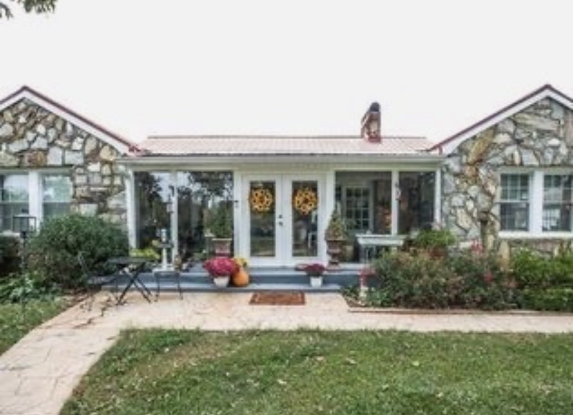
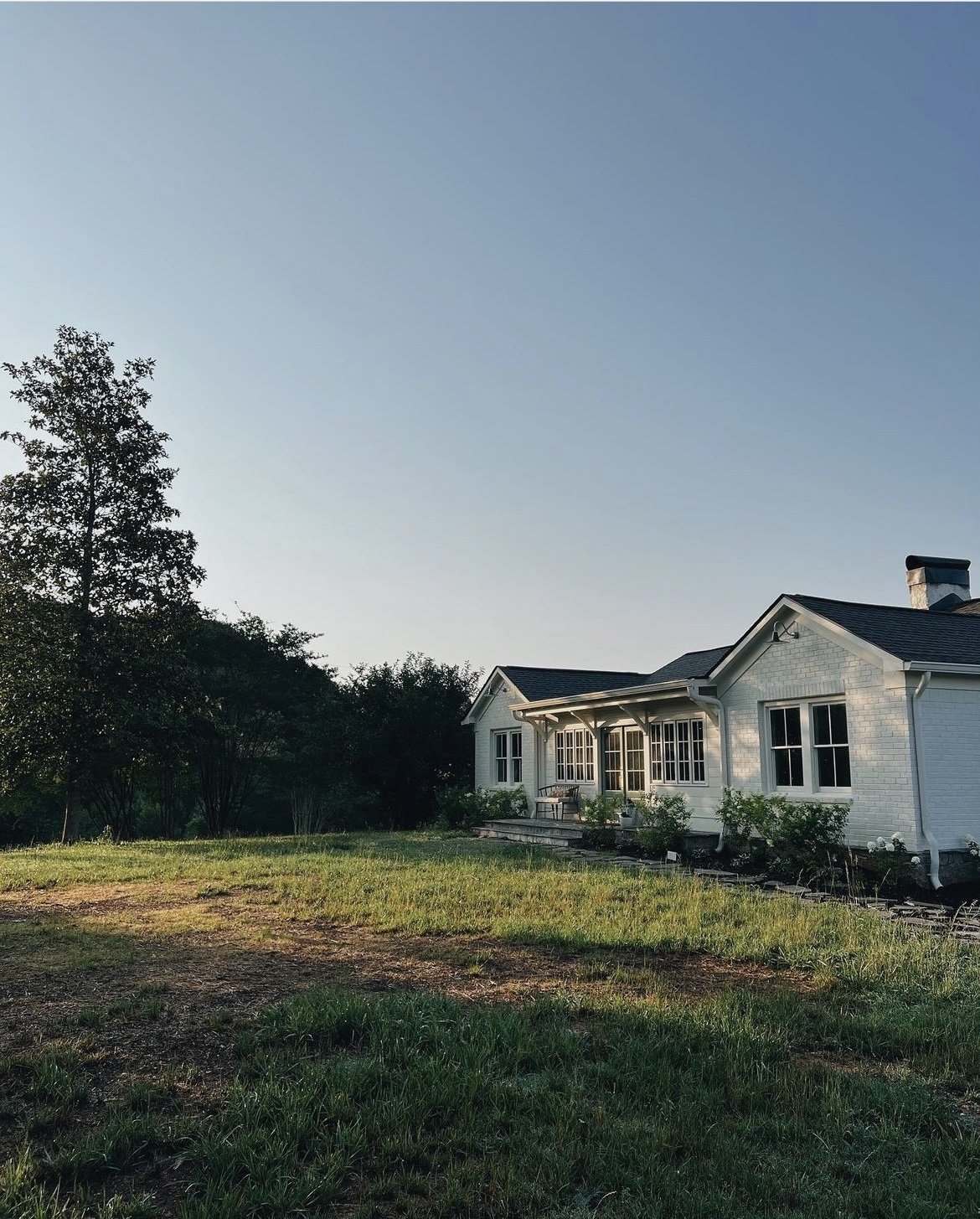
The exterior has changed quite a bit. Additional termite damage was uncovered towards the end of the renovation and we had to remove the granite, which we will later repurpose for the gardens! I love the way the mix of brick, shiplap, and board and batten covered in a creamy white turned out.
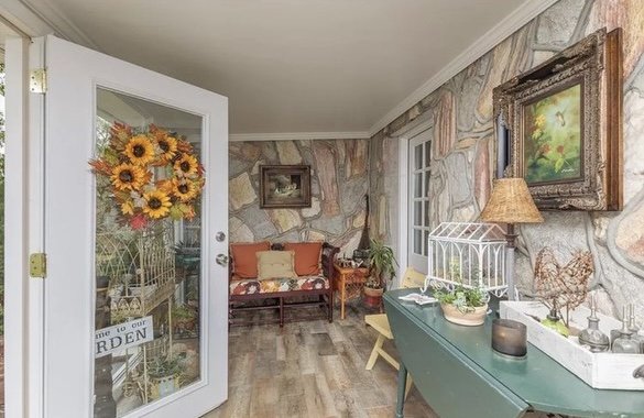
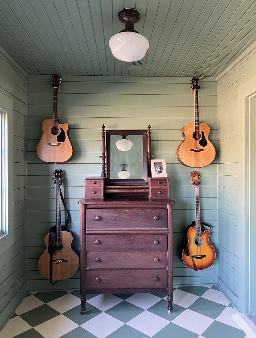
We were able to raise the ceiling in the sunroom after we removed the rock and added patched in beadboard to the ceiling and saved the original shiplap. Sam hand painted the harlequin floor. More on this evolving space here!

