Room Tour: Our Bedroom
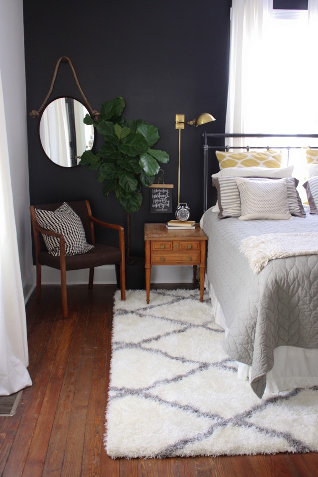
For
weeks
we have been working on our bedroom. It's been a really fun process because I've gone a totally different direction than our last home. Having a sort of "look" is super helpful when planning a space. Since "
" is ours, it serves as a guide. For instance, I found some art that wasn't a good fit at all and I knew that because I had some parameters. I also wanted to stay in a particular color vein: blacks, golds, greys mixed with warm woods and natural elements like the plants. Of course a couple of other colors were highlighted but those were the prominent ones. Let's get started! So excited to hear what you guys think. Hope you like it.
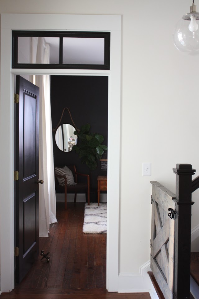
We didn't make a ton of changes to the bedroom other than moving the door to be close to the front of the house to make room for the stairs. We also added a transom window to make the height the same as the front door. We also consolidated the closets. The closets were originally on either side of the bedroom door and we combined them into one "big closet." We also use one of my most treasured pieces of furniture, an armoire that my sweet Lynndaddy made to hold pjs, workout clothes, shoes etc. Basically anything that can be folded.
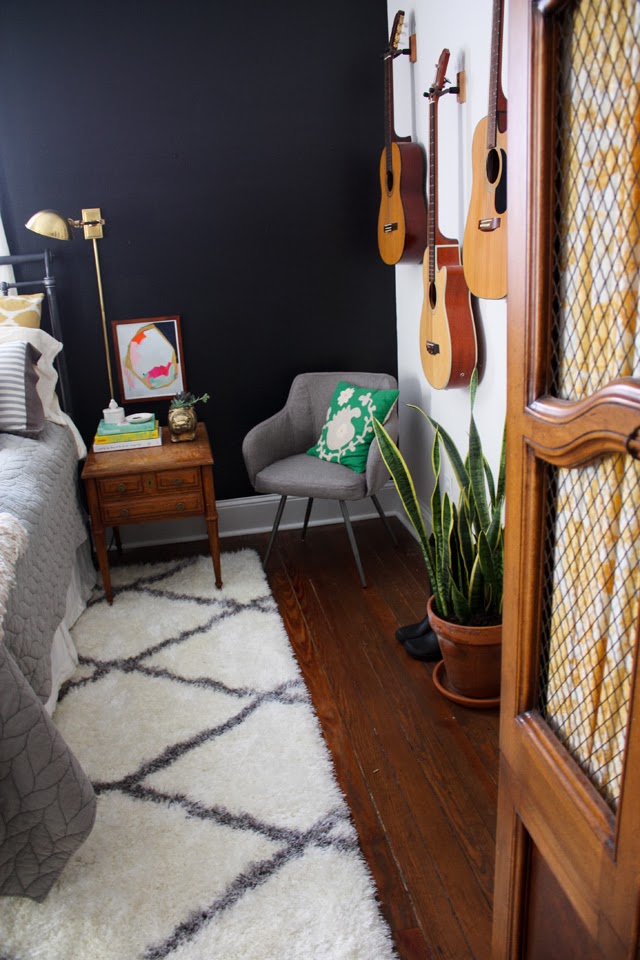

For Christmas Sam painted the wall behind our bed black. We used the same black throughout the house: Tricorn black by Sherwin Williams. I love it. I'm not sure how different one black can be from the next but this is a good one. I love the way plants and art pop against it. This print by the incredible
was given to me by my amazing sister for my birthday. She picked out the exact one I've had my eye on!

Our bedding was a Christmas gift from my Mama and I love it so much, the perfect blend of feminine and masculine. I gave her a few thoughts and she came up with the rest. Love it all! See below for resources! My parents gifted us our bed frame when we moved and I love it. The
are from IKEA and we've used them throughout the downstairs. They are really thick and high quality. I wanted the curtains to all look the same when people are looking in the windows from outside. The pulldown blinds are also IKEA. Sam hung the curtains at the ceiling, so the 10 ft ceilings look extra dramatic, which I love.
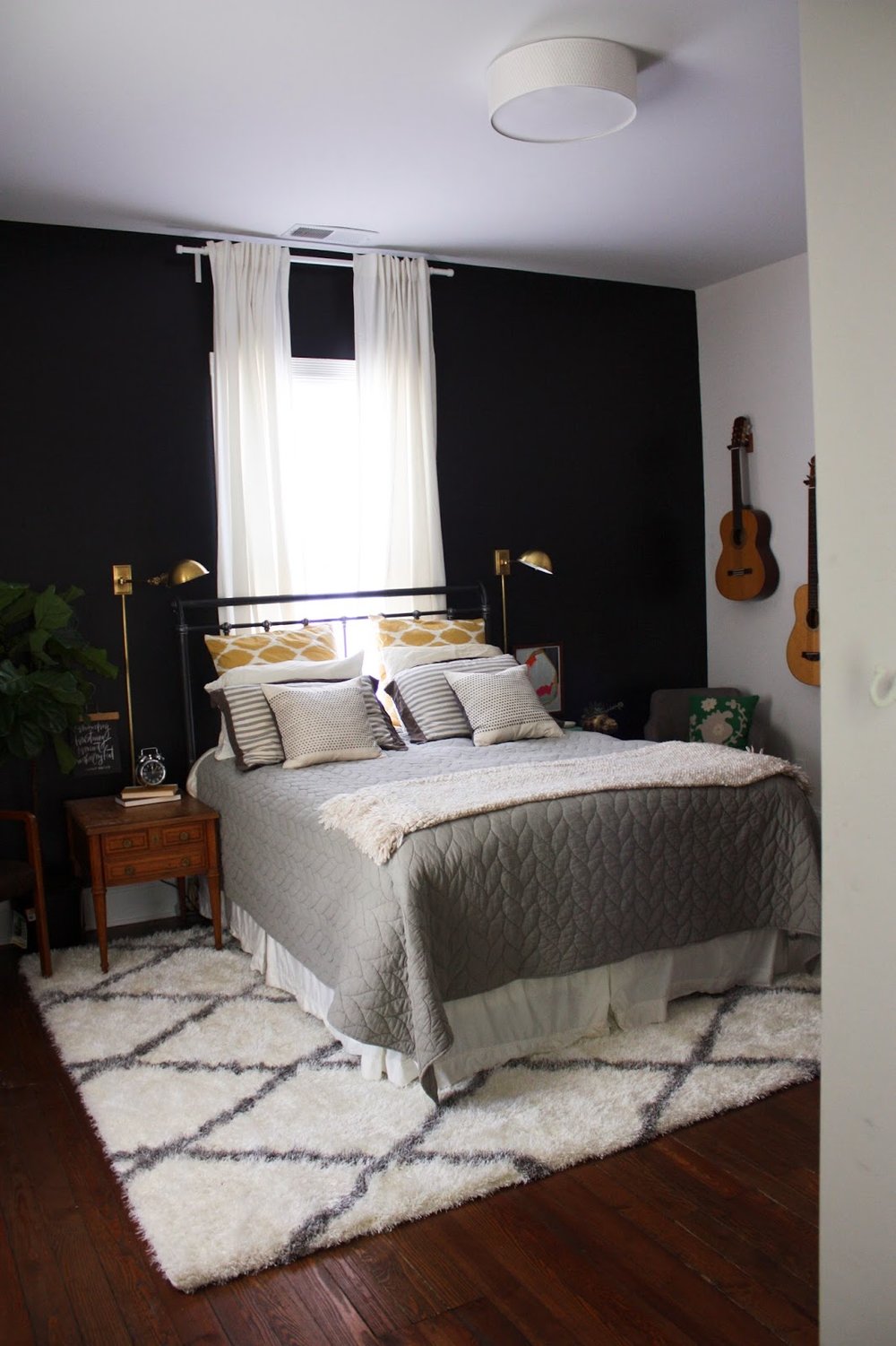
When we moved in we hung a repurposed ceiling fan that we had sprayed white to meet code. I
hated
it. An instant upgrade was this
from IKEA. Sam also installed a dimmer. Ooh la la. I want dimmers in every room. I'm not really a fan of overhead lighting but Sam is so that was a compromise. It is helpful when we are trying to hang things, I will say.

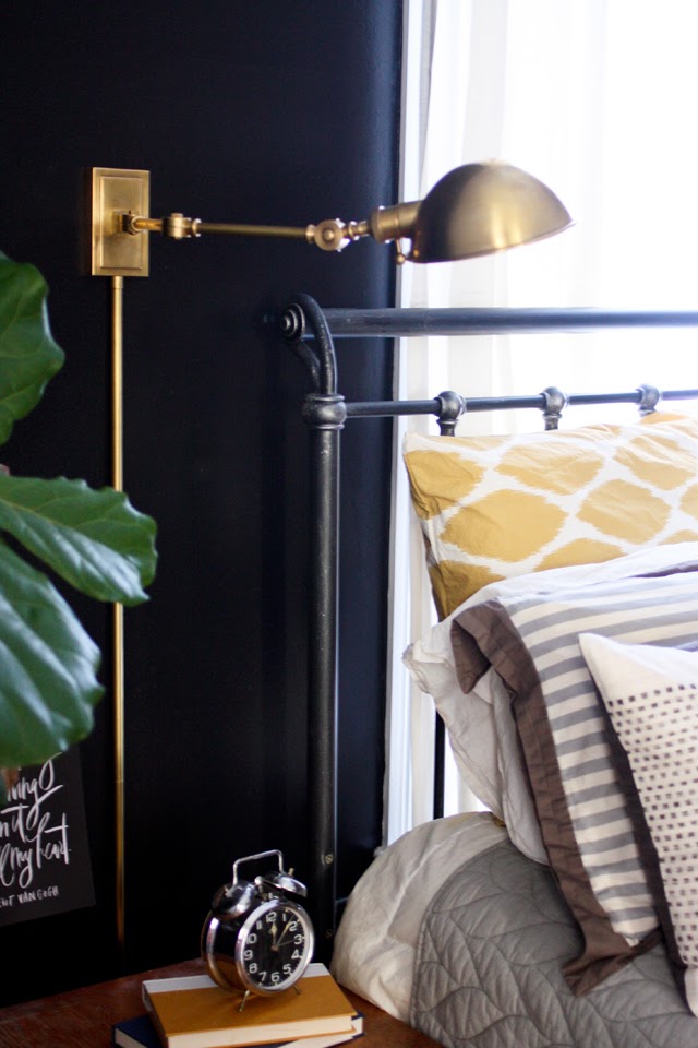
Speaking of lighting... ah, these
(similar
) are one of my favorite features in the room. They have a regular and "sexy" setting on the switch and pivot from side to side.
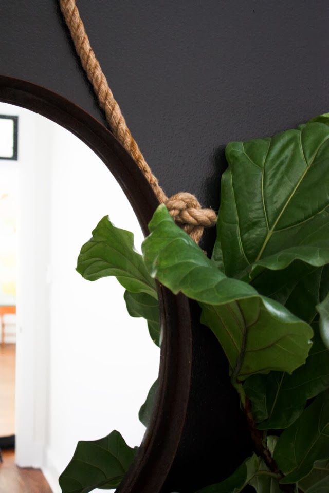
generously sent them as well as the
(very farmhous-y, right?) and that
(perfect for piling pillows on at night) to dress up our room. Sam hung the mirror to be at a height where we could check ourselves before leaving for the day.
The rug is another favorite feature in the room. Our house was built in 1910 and the floors were laid on the dirt. No sub-floor. The winter chill goes straight through the cracks. This killer
from PlushRugs is so soft and thick and
cozy.
We all like to get on it barefoot just to soak in the plushness. They get their business name honestly. I also love the contrast of the white and the dark floors. It really breaks up the bed and floor nicely. I haven't noticed any shedding and the price really can't be beat. Be sure to stay tuned for something amazing tomorrow. Hint, hint.
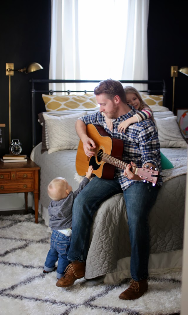
I love these people. The best part of any room are the people in it, right? I thought this Van Gogh quote print from
was the perfect one to represent marriage. We are in it to win it, through and through.

Bedroom resources:
Wall color: Tricorn Black by Sherwin Williams
Bed frame: not sure, sorry!
Bedding: west elm:
,
,
,
,
(on sale!)
Lamps:
Curtains: IKEA
Rope Mirror:
Rug:
Bedside Tables: Vintage
Occasional chair in grey:
Navy Geo Print:
Van Gogh Handpainted Quote:
Hippo planter: Home Depot
/
/
/
/
