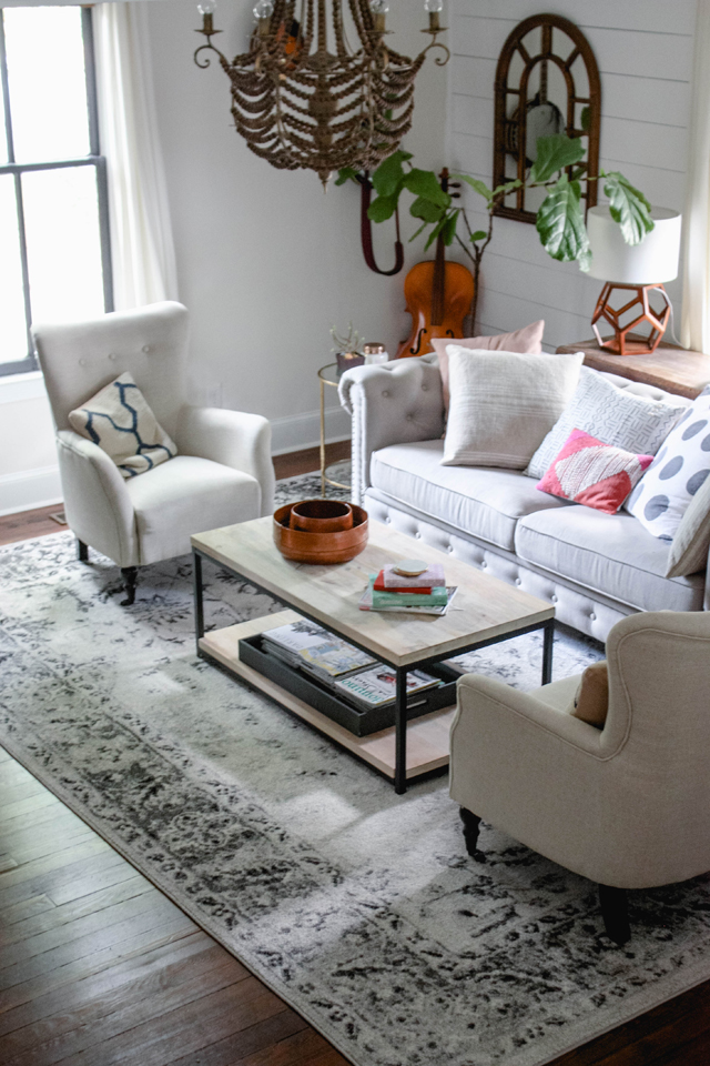
Living Room Style Swap
Ahhhhh! I am so so excited to share our living room makeover today! This room had been completely on the back burner since we moved in and now it makes my heart sing. This space was a hodge podge of hand-me-downs and completely cluttered so I jumped at the chance to collaborate with
and my dear friend
for a style swap! She helped me design this space and I helped her design her dining room. It was SO much fun and I adore her style so having her advice was amazing.
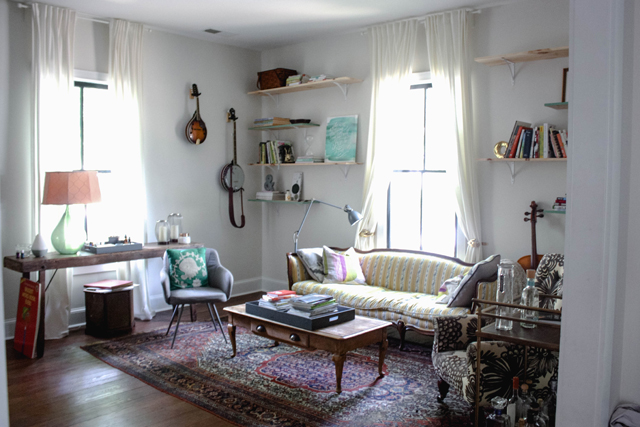
Here is a lovely "before" shot where you can see first hand that this room was in need of some TLC. Sam put those shelves up earlier this year and it always felt a little busy to me and just way too many colors. Having little ones that were growing out of the toddler phase, I was craving both serene but also a bit more sophisticated. I wanted a comfortable family room that would double as a stylish space for a girl's night in.
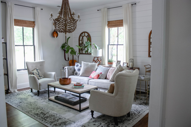
To personalize the space and stay true to the feel of our 1910 farmhouse, my Dad and Sam got to work on hanging
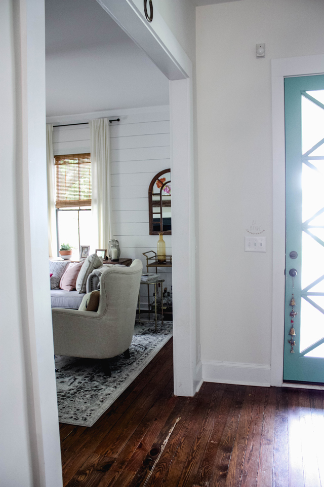
to brighten things up and add character to the room. The paint color is Behr's Polar Bear in Exterior Matte finish.
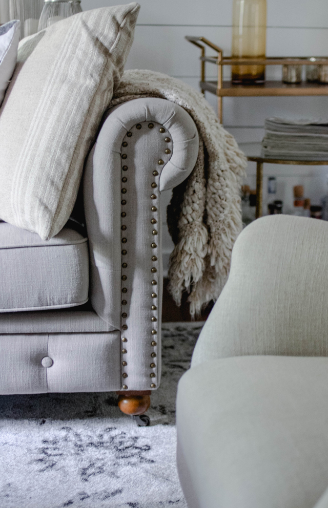
Anna and I both picked out the foundation pieces for our rooms. I chose this
in Natural Linen and this incredible
. I then pinned some inspiration photos
for Anna to look at and go off of so that she could get a feel for my style and the look I was hoping to achieve. She totally nailed it with this space!!! So grateful. I love Anna's taste, so getting to pick her brain and having her style the space was a dream come true.
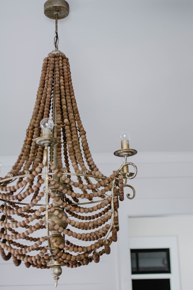
Love this
SO much. It reminds me of lighting that would be in a gorgeous beach house! We had it installed with a dimmer and I like the modern look of using the round light bulbs.

Anna chose the
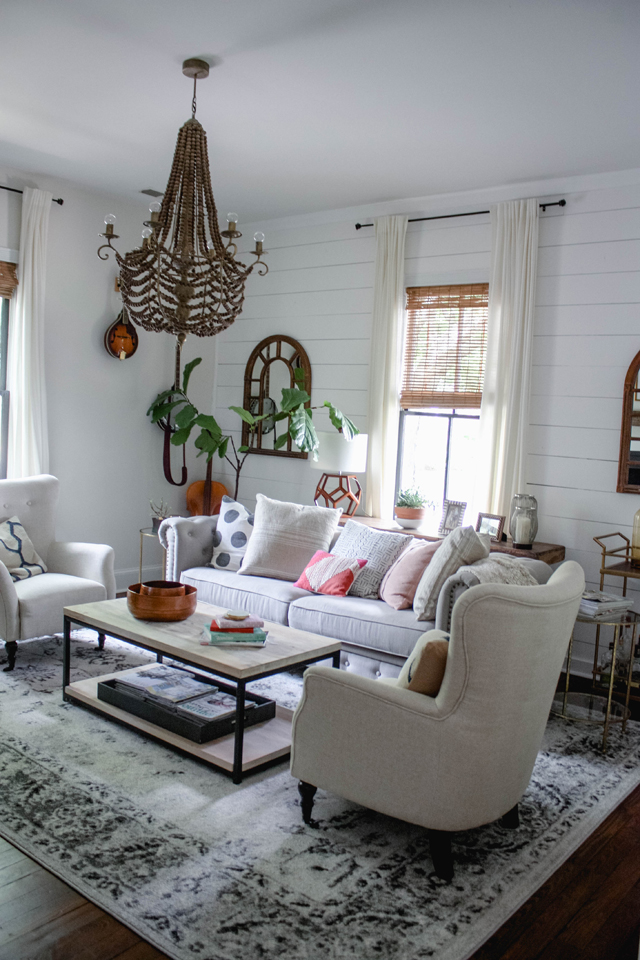
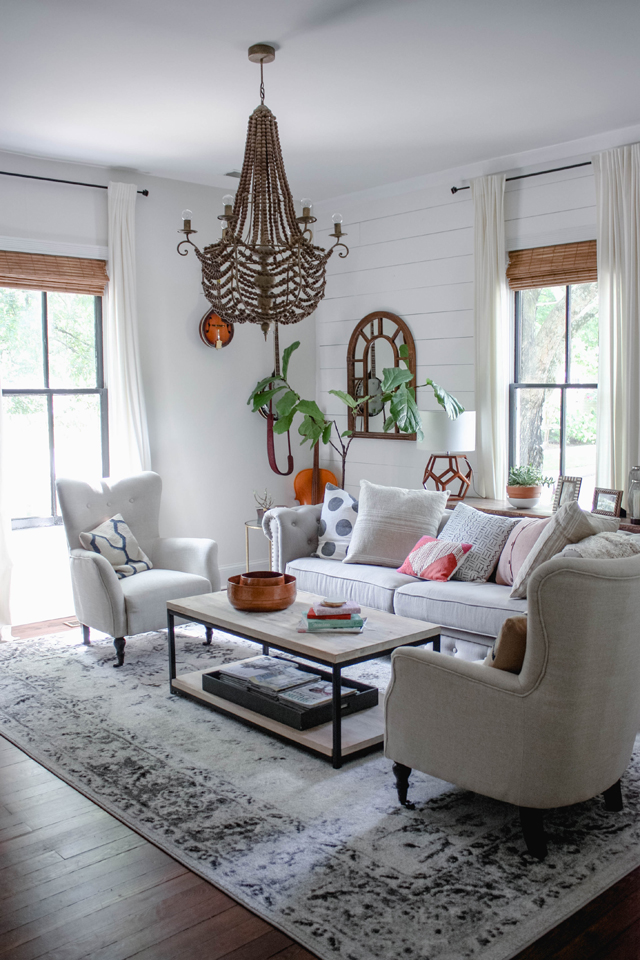
in gray, which adds a really nice neutral feel to the room and I love the contrast of the cool, airy tones against our distressed floors. I really wanted the space to be very light with lots of texture and natural elements. This
in the white wash offers amazing storage and a clean silhouette that I love. She also paired matching
to open up the room and give the illusion of more windows. I adore the symmetry!

Two
flank the coffee table and in person they are really lovely. Although they are polyester, they look and feel like linen. The perfect neutral chair with a nice high back and long seat to make for cozy seating.

I really wanted to be able to have my girl friends over for a glass of wine and fell in love with these brass
that Anna chose to add a touch of glamour. I love the way they pair back with the antique brass in the chandelier. We tucked them far enough back to protect them from little hands and running little ones!

We used our existing curtains but the rods were updated to this pretty
that really pops and makes the black trim on the windows stand out. Anna layered in more texture with
in "honey."
Anna also layered in such really great accessories like this adorable lamp and these yummy
Hobie striped pillows in ivory
.

She also picked out these gorgeous
for the coffee table and this adorable
.
In lieu of wall shelves, Anna grabbed this industrial
to hold books and odds and ends. It looks a lot more pulled together and makes grabbing a favorite read on sundays a breeze!

Here is a peek of the TV wall/fireplace before...

We ditched the black for more shiplap and hired someone to install these simple shelves to display some of our favorite photos of the girls as well as some pretty things. Anna chose this
to replace the midcentury credenza (that we moved to our dining room!). It makes watching movies SO much easier! I love the distressed finish and little pops of pale blue paint.
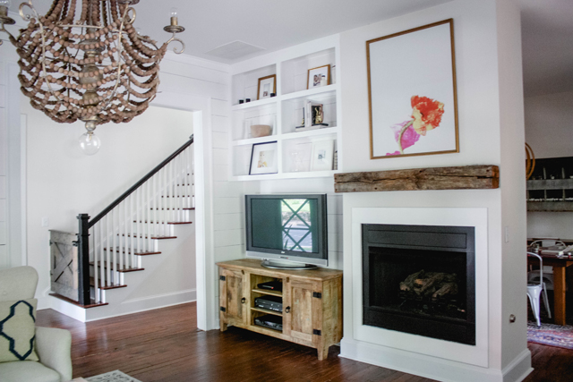
Love seeing the side by side transformation!! We painted it black to disguise the TV but whitening up that corner just makes the room look so much bigger. I also love my friend
above our fireplace.
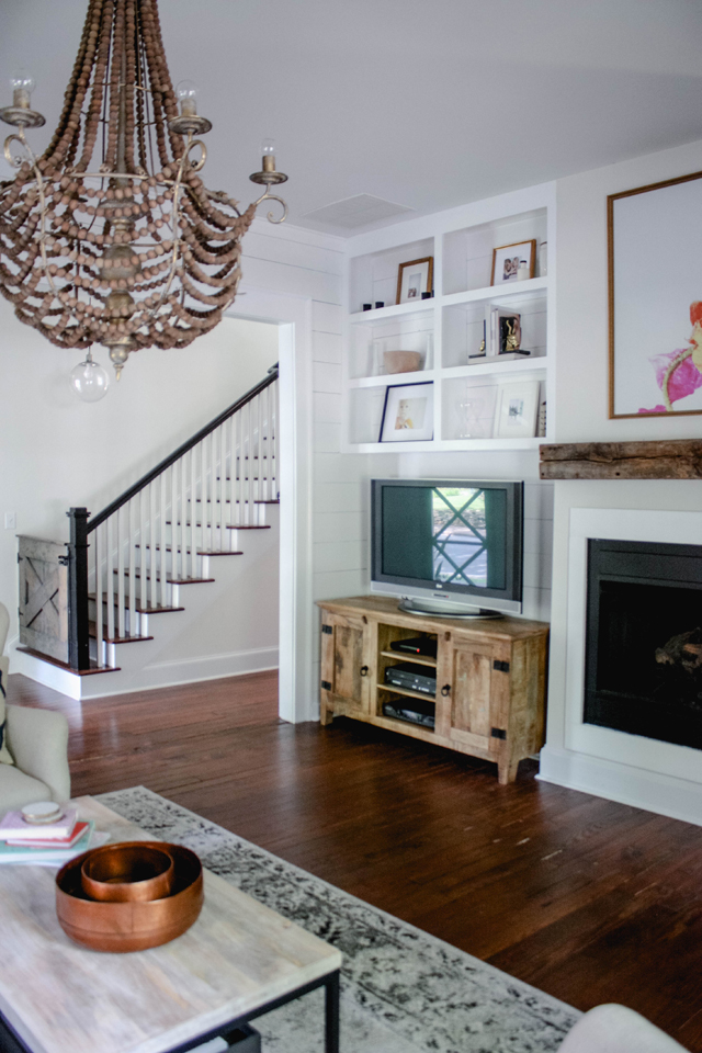
A closer look at the TV stand. This piece is a favorite of almost everyone that has come over. I love having the simple storage as well for DVDs and little toys.

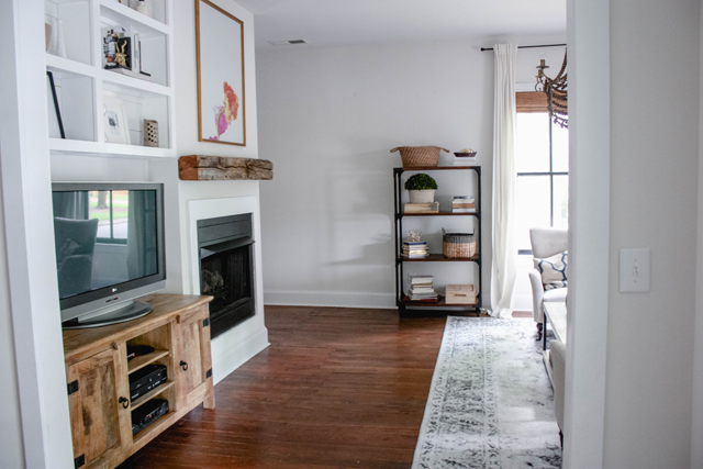
Hope you guys love the space as much as we do!! Huge thank you to
for her design brilliance and to
for sponsoring this post! Loved working with them. Their pieces are so beautiful and reasonable! Couldn't believe how wonderful their prices were for the quality.
