Style Swap with Home Decorator's Collection: Anna's Dining Room
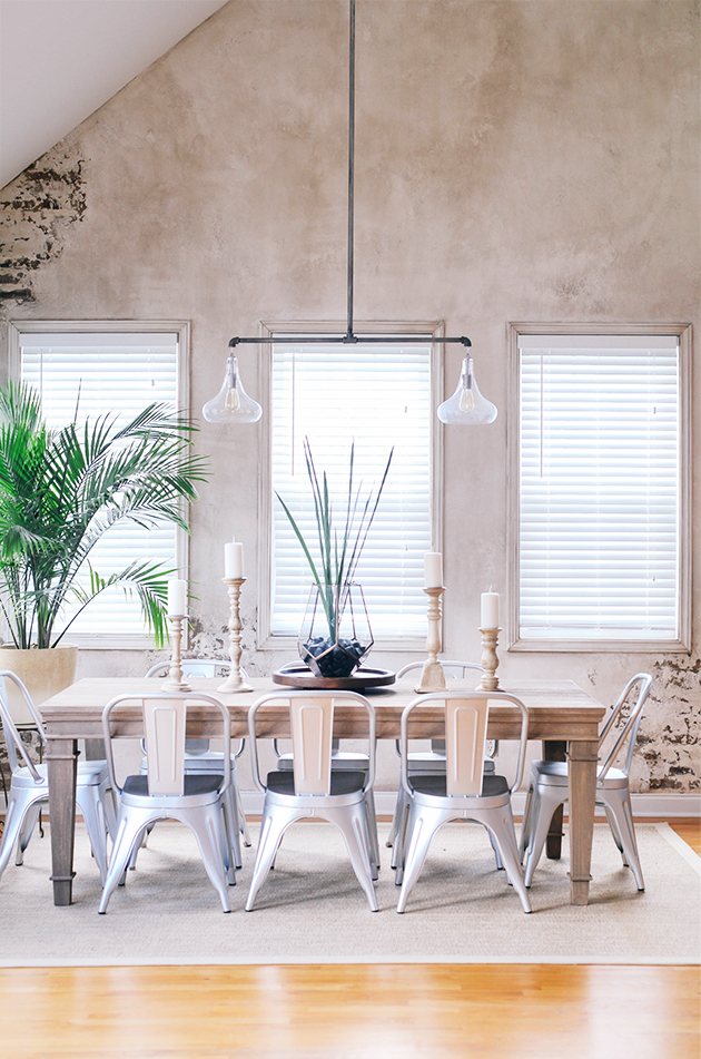
Ah!! So excited to share my friend
gorgeous dining room that I helped her design along with the help of
gorgeous pieces. As you may remember from my earlier post that Anna and I did a style swap over the summer where she helped me design
while I helped her design a stylish but family-friendly dining room for her adorable family of 7 (Anna just welcomed her sweet baby girl to their family last week!!!).
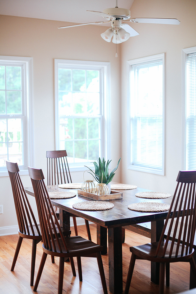
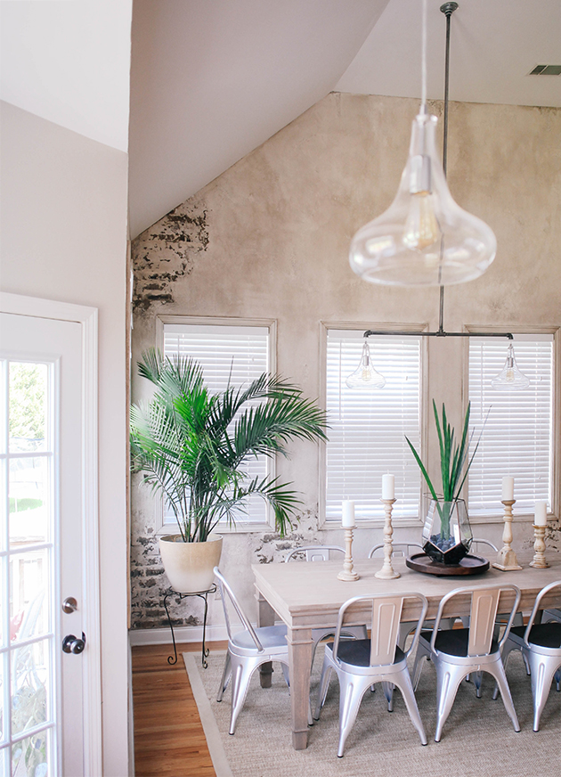
Anna and her family had just literally moved into their new home about a month before we started the design process. She had your typical "builder beige" walls and their furniture but that was about it. She wanted her dining and breakfast nook to feel like one cohesive space and be the heart of their home. I loved the vaulted ceilings but they also presented a lighting challenge so we started with the bones and worked our way to the fun details.
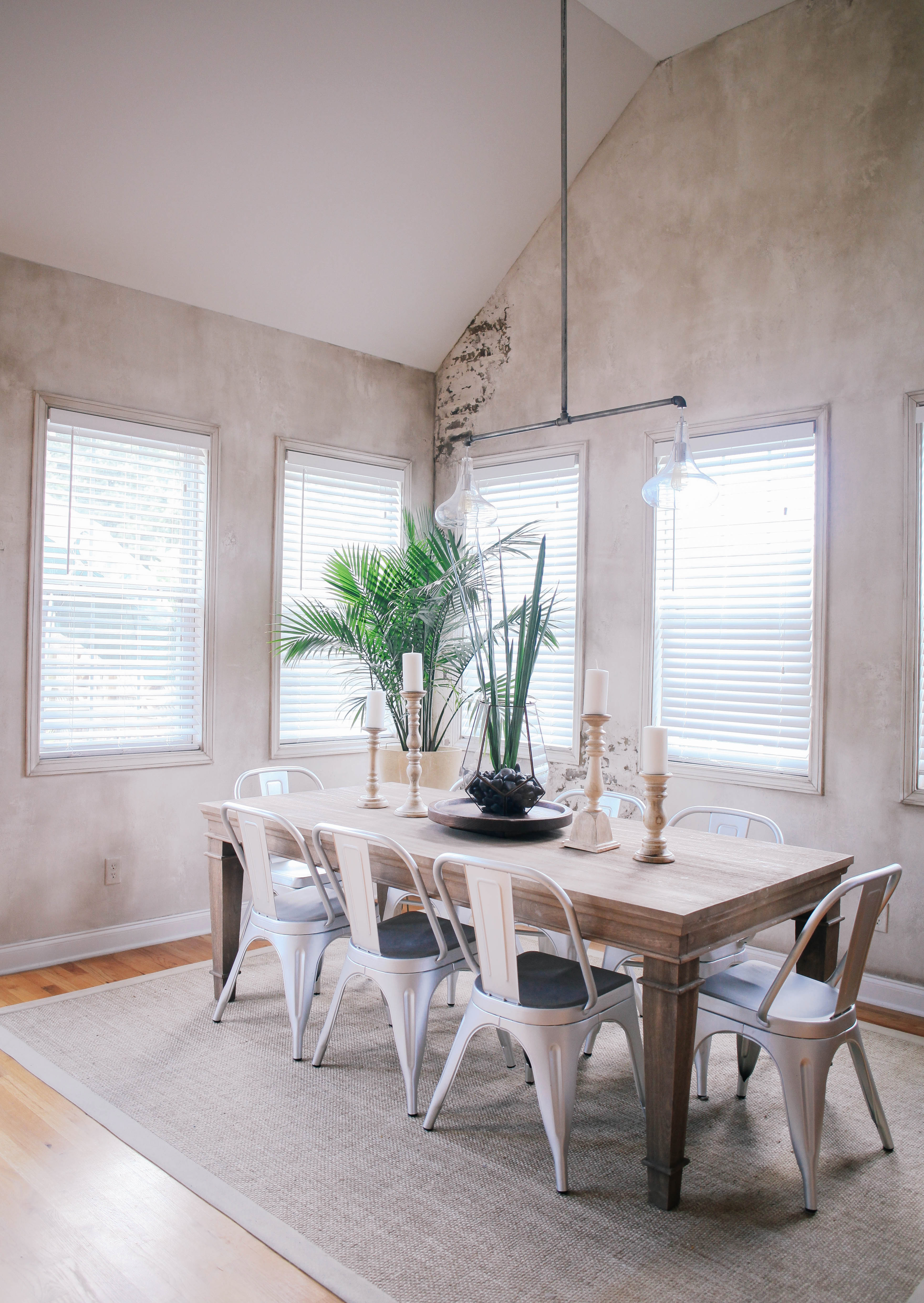
Anna wanted neutral and airy but also some edge and Spanish European feel. She met and introduced me to wall artist
who went to work on creating the aged brick accent wall. So neat, right?! The walls were brightened up with Behr's "
," a really pretty light grey.
Anna also chose the main foundation pieces:
+
- sandblasted with traditional legs, versatile for any decor.
+
- these metal chairs are easy to clean and add an industrial vibe.
+
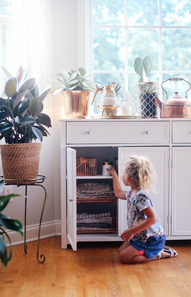
- amazing storage, neutral and also a great serving piece.
These pieces set the stage for transforming the room. After we originally chose a pretty traditional rug with lots of white, Anna had a moment of clarity of needing a rug that could get beat up. With now five little ones, she needed a work horse that added warmth. This
is neutral and nubby adding both texture and practicality.
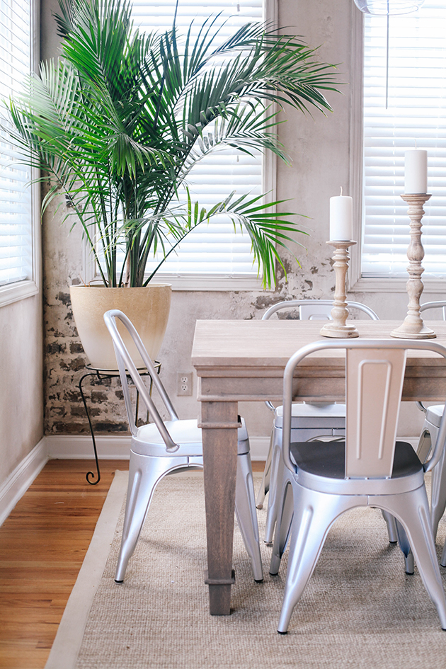
The next challenge was tackling lighting. I suggested mirroring the lighting so that we could tie the two spaces together (breakfast nook + dining room) and Anna was game. The only problem was getting the lighting installed and long enough with her beautiful vaulted ceilings. Anna's handy husband got to work on using pipe and flange from
to take two of
to make a unique fixture for their space over the table. I love the way it turned out! We used the same pendant over the buffet.
Other elements we used to bring the space together:
+ We kept the room airy with these
+ These beautiful
brought magic to the space and I love this
paired with
!
+ Greenery always adds life to a room. We used the
,
and
+ A coffee bar for the buffet using these gorgeous
, our favorite little
for sugar or matches, pops of copper with
and some of Anna's vintage pieces (see more of the buffet
)
Special thank you to
for working on this style swap with me - loved getting to be with you this summer and to
for sponsoring this amazing project. You can see more shots and stories of our spaces over on the
!
photos by
/
/
/
/
